Serving the Entertainment, Publishing, Advertising and Restaurant Fields
These logo designs are all for titles, meaning anywhere from Broadway shows to book, magazine, catalogue, or menu covers, plus an advertising headline.
These logo designs are all for titles, meaning anywhere from Broadway shows to book, magazine, catalogue, or menu covers, plus an advertising headline.

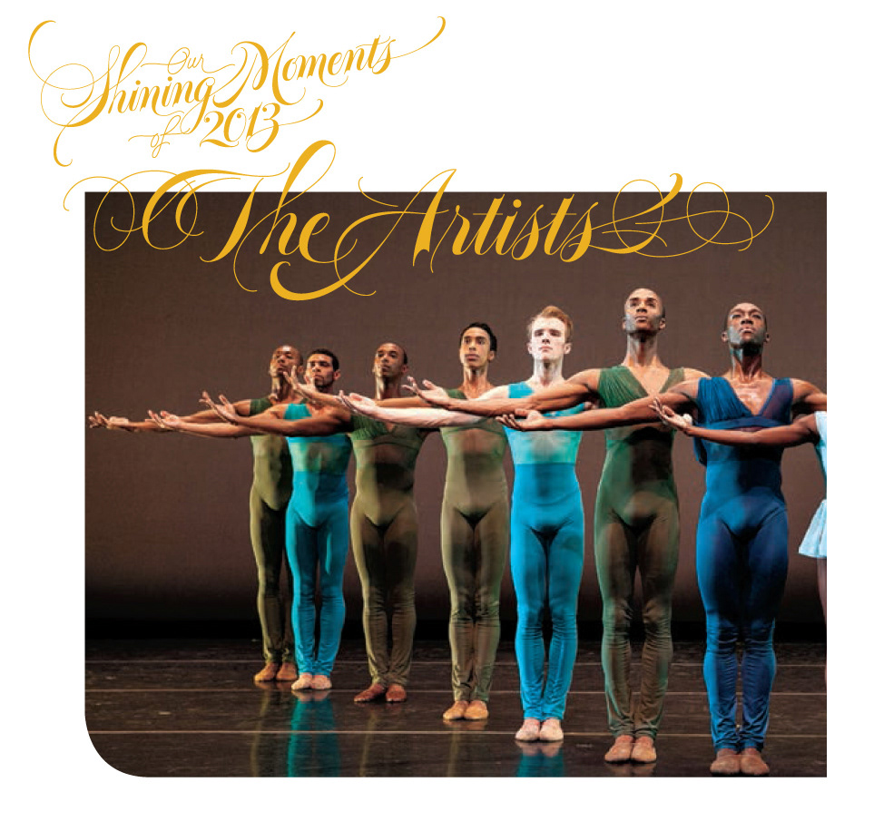
This print project involved a whole set of subtitle designs as well as the initial title page for "Our Shining Moments of 2013". Client: Essence Magazine. Art direction: Albert Toy. Creative direction: Erika Perry.

"Survivors" is by Erin Hunter, whose other series, Warriors, and Keepers I've also designed title logos for. Art direction Cara Petrus, illustration Julia Green, published by Harper Collins.

Several years back, it was a great pleasure to work with Gail Anderson, who art directed me on this project for Rolling Stone Magazine.
See above...

I had the privilege of working with the creative team of SpotCo, NYC, the agency that creates so much promotional design for the entertainment establishments around New York. The poster layout is theirs of course. Art direction: Jeff Rogers, working with Gail Anderson who creative directed this.

I worked with art director / designer Kevin Brainard on this title. The publisher was Picador.

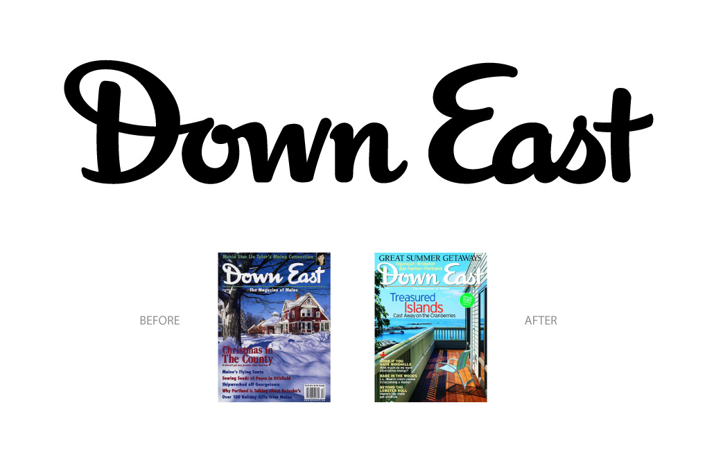
I got a call from the art director, Jurek Miroslaw, of this New England magazine, to redesign the masthead. The previous script was kind of 'dashed off', as it were. Still, due to the existing equity of the publicatioin, I was told to keep the basic "DNA" of the script intact, while giving it more grace and legibility - both parts of that equation which I love to do - adapting from an existing style, to make it work. The Esquire Magazine logo was also indicated as an ideal to pick up on.
This title was designed for an article in Martha Stewart Living, a few years back. Art direction: Matthew Axe.
This title was designed for a well know New York City restaurant, Tavern on the Green, in Central Park. It was part of a full title page design, with comparable flourished borders and line art illustrations that I had an opportunity to work on, for the first time, in '98 when this was created.

This was a title logo for a Bloomingdales catalogue for specialty international clothing styles, culled from around the globe. Creative direction - Amy Sears. The agency at the time was Ambrosi.
This little piece was awarded for "excellence in design" by "365: AIGA Annual Design Competition, 2007". The head of the Illustration and Cartooning department, at SVA where I teach contacted me a few years back about creating this. Knowing that the book, on which the title went was to promote the senior cartooning majors' work was an inspiration. I hadn't gotten to do much work for cartooning in awhile, which added to the sheer draw of this project for me.

This calligraphy went on the cover, etc.. for a Bloomingdale's spring catalogue and print campaign.
This magazine article title was created for Martha Stewart Living's October issue a couple years back, the article dealing with various creative Halloween celebrations, including the craft of pumpkin carving. The art director was Kevin Brainard.

This advertising headline was commissioned by Daniel George Wan, creative director at Catalyst Agency in Singapore, Asia. It was a privilege to work with him - across continents;-) on this logo for a life insurance ad.

This title design was the dramatic, script part of a Batman title, in a series called "Underworld Unleashed". Done for DC Comics, art direction by Georg Brewer.

Here's another custom cover title I had the privilege of working with Kevin Brainard on, some years back, for a Harper Collins publication. Like all of my cover logos, it's drawn from scratch.

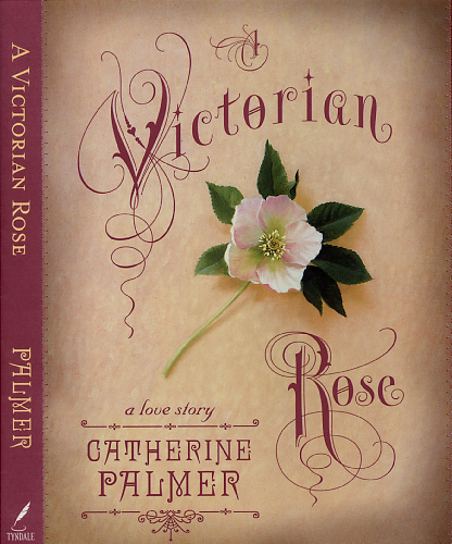
The client for this title was Tyndale House Publishers, in Chicago. Art directed by Jenny Swanson.
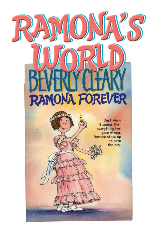
Years back, I had the pleasure of working with art director Russell Gordon on a series of titles in this quirky, innocent style, for Beverly Cleary's Ramona book series. Curiously, the covers have since been changed. I'm wondering - was it, in spite of its expressive charm, deemed a bit too juvenile for 8 year olds(?;-) I put it up here anyways.. For one, it's different.
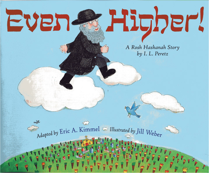
Pieces like this, emulating another cultural alphabet like Hebrew, Sanskrit and so on, are always fun. Publisher: Holiday House. Art direction: Claire Counihan.

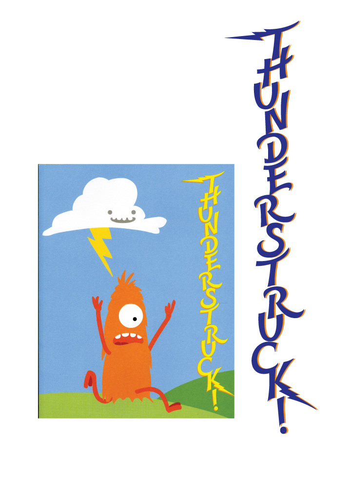
I worked with Evan Ginsberg, of Studio 110 who art directed this project in which I custom designed a lettering style, adapted in a simpler form for the sub title, reminiscent of lightning. Captain Zoom is a kind of "space age" mascot for this line and website for personalized birthday and other special occasion songs.
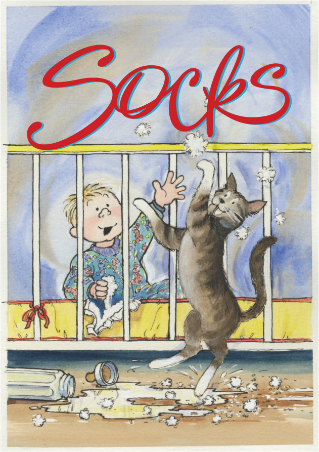
This title was designed for Harper Collins. The art director was Kathleen Flanigan. Since this series was released, I noticed years later, the Beverly Cleary books went through still another iteration of redesign. The current 'Socks' title is more sweet and innocent looking, not (rambunctious;-) like this one.