2016: The beat goes on....
The following are images from several different clients. I'll describe a few of them here, and also on the individual captions as you scroll down:
The following are images from several different clients. I'll describe a few of them here, and also on the individual captions as you scroll down:
Colle McVoy agency from Minneapolis contacted me last year about casual script for Land O' Lakes farm family 'sentiments' online promo campaign. Also, Prime Access, an agency representing Merck pharmaceuticals was looking for various hand writing styles, representing several real personalities likely to be benefitted by their HIV product, "Isentress" and so another campaign - this one in print ads, was serviced by my handwriting script designs. Then in the fall of last year, Essence magazine got in touch about an opening title page design with several sub titles for their article titled "Our Shining Moments of 2013"
"Blanc de Noirs" branding script for wine label was created for Lateral Branding, in Barcelona, Spain, end client Codorniu. For the rest of my brand logo designs, check out: "Special Work for Branding..." and "Logos: Corporate ID and Branding" on this site. I also got an e mail from AKA, a London based ad agency specializing in entertainment promotions, asking me to work on the "Potted Potter" logo, which is - as it might sound - a spoof on Harry. (Be sure to check out my "Titles: Broadway Shows, Books, Magazines, etc." page on this site.)
This logo was created recently for a course I am teaching at SVA, and as a theme for my design services.
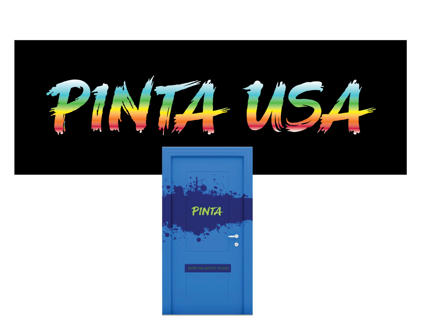
Yury Vargas, the creative director at Prime Access, an ad agency in NY city, whom I was already working with on the Isentress campaign, got in touch with me about this special design project for a start up agency specializing in advertising to the latin market in the US.
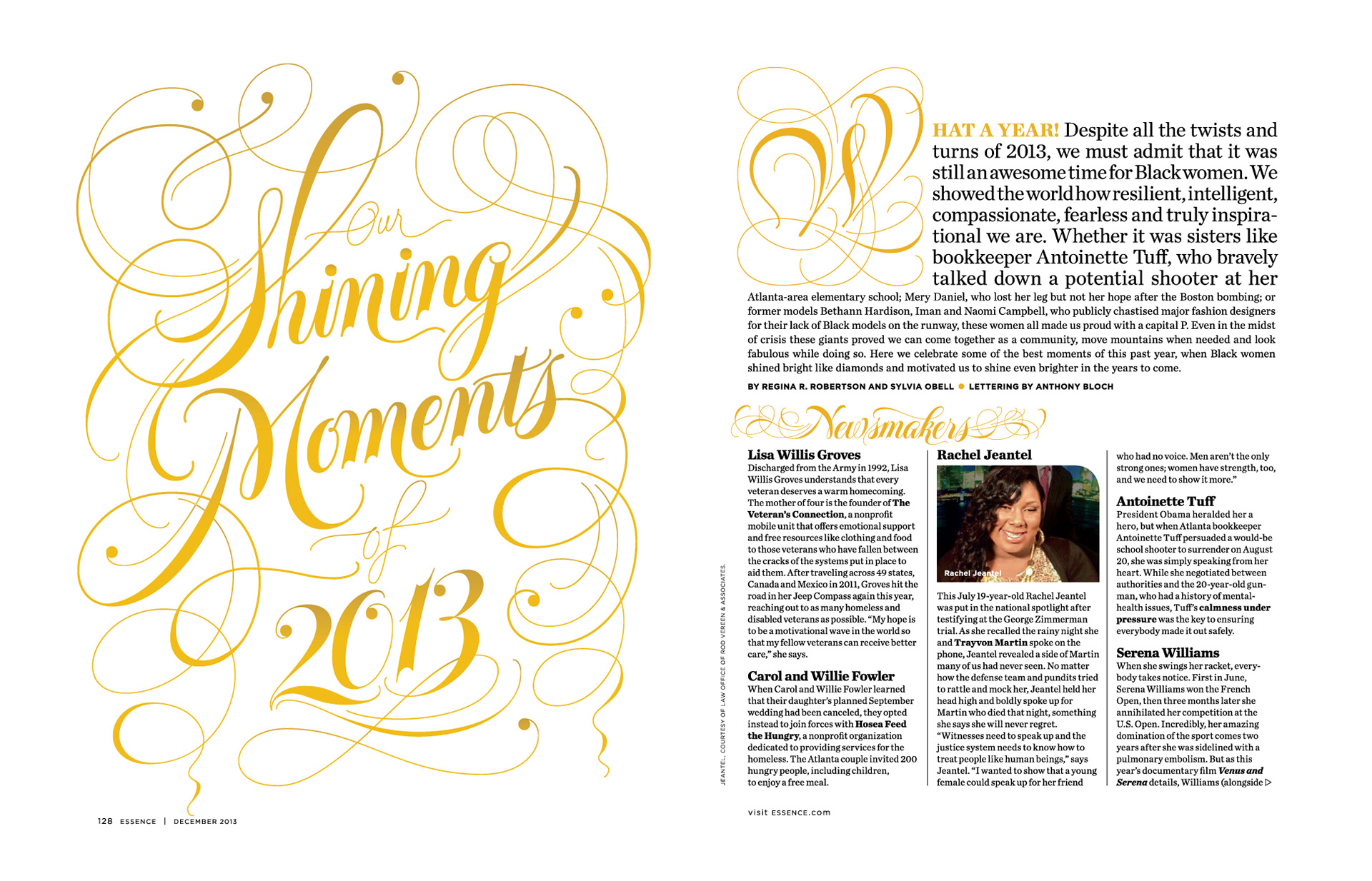
This print project involved a whole set of subtitle designs as well as the initial title page for "Our Shining Moments of 2013". Client: Essence Magazine. Art direction: Albert Toy. Creative direction: Erika Perry.
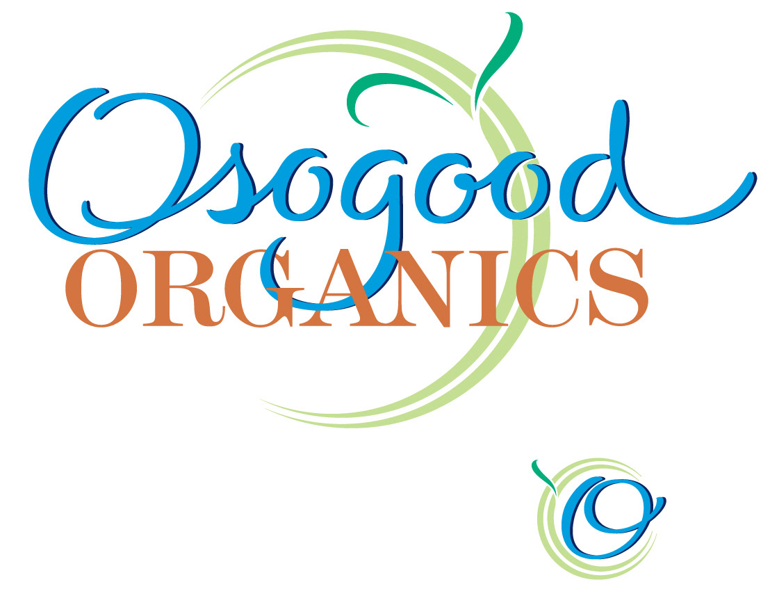
Debbie Osgood is the creator of this new line of natural skin care products hitting the market in California. The logo was completed early this year.
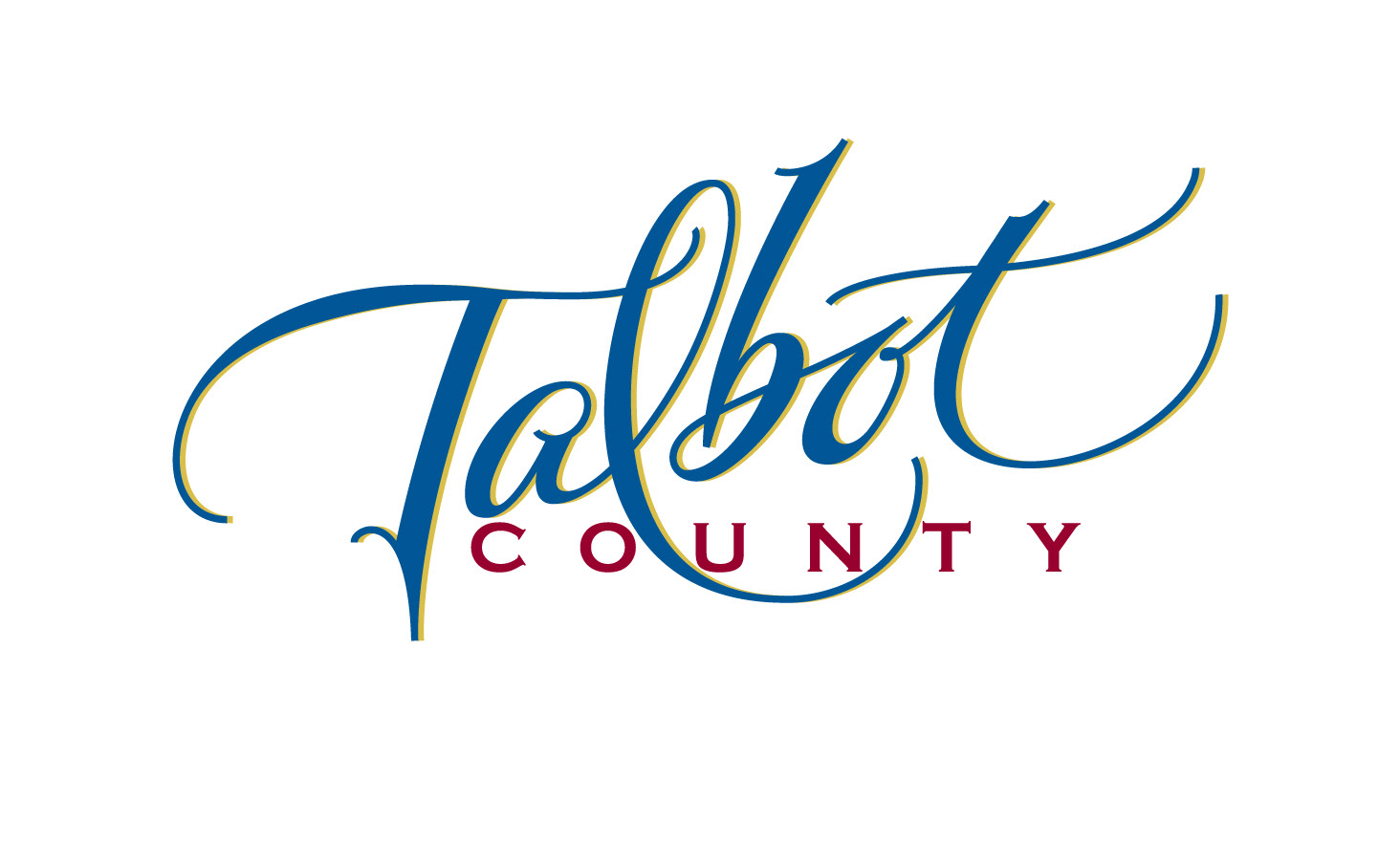
I was contacted by Cassandra Vanhoozer early last year - the director of tourism for Talbot County, Maryland, and asked to create a logo that would convey both the luxurious and relaxed character of this ideal vacation spot on the Chesapeake Bay. Here it is in action:https://www.youtube.com/watch?v=pCROe4dAHWI
It has been a pleasure and an inspiration to work with Justin Agosta, a young up and coming street wear entrepreneur, for whom I've created some t shirt designs.
Joanne Pagliero is both a real estate agent and works creatively with houses, doing staging and interior design. So, she wanted a logo that would convey both artful and classy value.

Client: Land O' Lakes. Agency: Colle McVoy, Minneapolis. Art Direction: Daniel Jenstad. This is an online promotional campaign, with many different 'sentiment' quotes. For more, connect with: http://www.landolakes.com/farmfamilies/
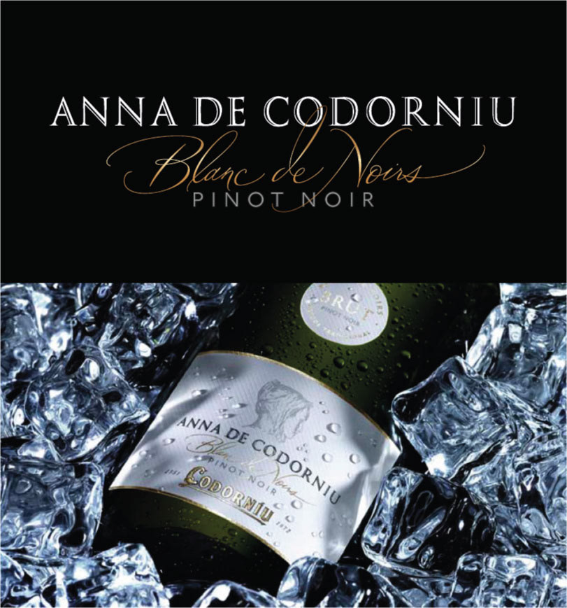
"Blanc de Noirs" branding script for wine label was created for Lateral Branding, in Barcelona, Spain, end client Codorniu.
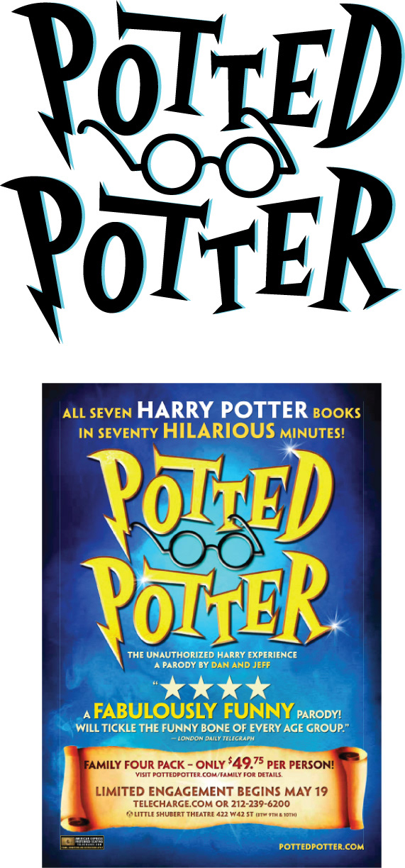
AKA, form whom I designed this logo, is a London based ad agency specializing in entertainment promotions. Potted Potter is - as it might sound - a spoof on Harry (same-name;-). The poster is designed by Adam Neumann, with whom I worked directly. Art direction: Bashan Aquart.

I was chosen to develop various handwriting styles to represent different personalities, the later from a pool of real people, selected from the target market for this HIV medication, who had bee photographed for the print campaign. Agency: Prime Access, NY. Design direction: Margarita Pesces. Creative direction: Yury Vargas.
I was contacted by Alexander Isely, whose design firm was completing a full identity project for Goodwill Industries, CT branch, and who wanted a script logo for the store.
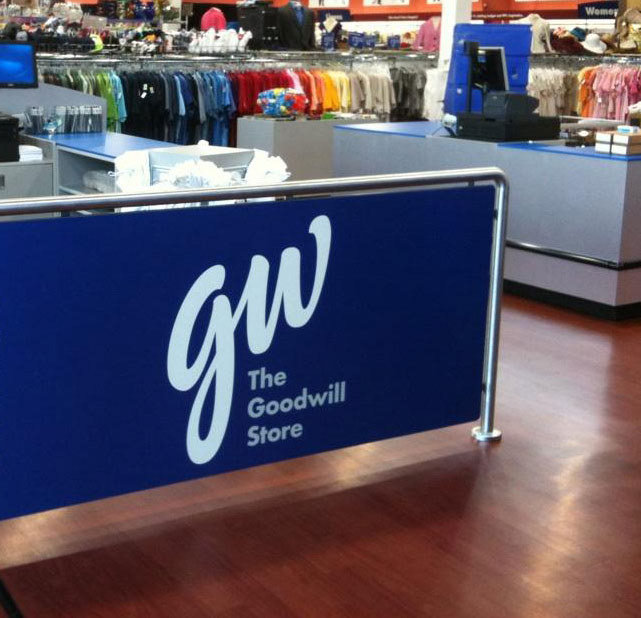
Please refer to the above image caption, as this is a snap of the store signage.
This logo was designed for a young entrepreneur in the urban fashion industry.